There is discussion going on in GNOME for Empathy on where a great place to put the protocol icons would be. With some new enhancements that are on their way into Empathy, there will also be a cell phone icon signifying those contacts that are mobile.
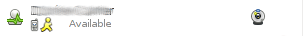
Currently the contact entries look like this:

Notice that the protocol icons are in the status icon.
Now since there is the soon-to-be addition to Empathy for mobile statuses, there is going to be a cell phone icon to notify you of this case. The issue that is going on in Empathy is one about where this cell phone is to be placed in the contact entry. Look at the following empathy-dev mockup:

Without having to read through the bug, the gist of the issue is that the icons on the right are really for user interaction (i.e. the camera can be clicked on to start a voice chat with someone), and the phone should go somewhere else.
I have since then submitted a mockup of my idea for a placement of the protocol and phone icons as follows:
Now, where do you come into this picture? I would like to get users submissions as to new mockups for contact list entries. I'm not just talking about the protocol and phone icon placement, I'm talking about a complete redesign of the contact entry.
There has to be the following items in the contact entry:
a)contact name
b)contact icon
c)status icon
d)protocol icon
e)phone icon
f)webcam icon
g)status message
Please submit them to me in an e-mail to bcurtiswx@ubuntu.com, but don't attach any mockups you make, please upload them to an online source and send the link in the e-mail. You can also post your mockup links in the comments section of this blog for others to look at.
Happy Ubuntuing!

With Facebook, I have more friends online at some point every day than fit in one vertical list. A single column doesn't cut it anymore, hasn't for years. We need file view.
ReplyDeleteThe Face is the file icon. The protocol is an emblem over the bottom right corner of it, and their name is where the file name would be. I would literally consider making .person files and using nautilus with a custom contextual menu for rendering the buddy list.
Even the mockup you posted on this blog, look at that. Glancing at it only gives you info on maybe 1/3 of your contacts, and 2/3 of the space within that window is wasted. If you could have a grid, you could use that 2/3 of the space to show the other 2/3 of your contacts.
ReplyDeleteNobody really cares about protocols. The protocol mess is a result of the big egos of software companies. People only want to talk to friends, and don't care about the implementation. :) (I'm the person that suggested removing protocol icons from Pidgin)
ReplyDelete@Ethan, that's an interesting idea. Where would you put the status message of the contacts? IMO status messages would need to be easily readable on the contact list.
ReplyDelete@Hylke, to play devils advocate here. Libfolks is coming to Empathy which will support contact merging. Would you say that it would be good to know which protocol you're talking to your contact on in that case?
ReplyDelete@~Brian C. For some edge cases yes. That's why Pidgin still displays them in toolips. Also, it's handy to have them when a contact is expanded to show all his/her accounts. But on the contact list where people are the top level "object" they should not be shown.
ReplyDeleteI know it's maybe not the place nor the moment to debate about this... But:
ReplyDeletea)contact name
b)contact icon
c)status icon
d)protocol icon
e)phone icon
f)webcam icon
g)status message
God, that's a long list ! Is it really necessary to display all this ?
a) ok, makes sense
b) yes, mandatory too
c) ok, this one too. On your mockup, you display this information twice right? In text and with an icon. I would not keep things like "available" when it's obvious that the icon is saying the same.
d) do I really want to know that when I look at a contact ? I don't... And in fact, I don't want some contacts to appear twice or three times if they are using different protocols. I would prefer to see the contact just once, and it should use a default protocol to send messages.
e) phone icon ? Same... I'm ok to see it if I move the mouse above the contact, but in the list? I just want to know who is reachable.
f) webcam, same. I can check using a pop up window when hovering. I don't want to do webcam chats very often. I can check manually.
g) mandatory one too.
So that's already four of them to display. Quite a lot. But seven ? That's too much info in such a small window, that make things confusing I think. Gnome is about simplicity, I hope I will have the option to hide those icons if I can.
And I don't know if "one contact = 1 row" is the best thing to do. As Ethan noticed, a lot of room is wasted. So I would maybe try to display the users in a small box, maybe 150px large, so that we can have 2 per row, or maybe more. Your mockup is closed to what I would imagine:
-photo on the left
-Name
-status below in grey if necessary
-status icon on the right
And that's it... Other info, in the pop up window.
I know it's minimalistic, but it's Gnome right ? :)
@Francois, I think it would be more appropriate to mention that there should be a place for those items, not necessarily in the contact entry, since the options above are all available through empathy.
ReplyDeleteI don't want to totally get rid of them, but I would make them one click away and not display them by default.
ReplyDeleteDid you see how Meego does it ? (http://guermonprez.eu/paul/blog/public/images/intel/meego/netbook/06_messenger.png)
I like this idea. Simple, big photo. It would work for Empathy window too I think, with a neat way to display all the complementary options.
Protocol icons? Why would I care about protocols?
ReplyDeleteI want to talk to People. Protocols are just an implementation detail.
You don't have to have protocol icons at all times, just a place for them to be when the option to have them is turned on. Plus, these are your mockups. Do whatever you please :D
ReplyDeleteThose action buttons are clumsy anyway. They don't have tooltips, it isn't really clear what they do, they don't behave like typical buttons, there is ALREADY an icon there that isn't related an action, I am always afraid of clicking one by accident, and the area doesn't have much room to grow anyway.
ReplyDeleteMy suggestion is to rip the action icons out and burn them in a fire.
Now, add something to neatly replace it. My suggestion is something more obvious within the conversation window. Wherever that goes would also be a good place to incorporate changing protocol when contact merging is implemented.
Now you have lots of space.
Brian: sorry for sounding a bit negative in my earlier comment. Me and Hylke will put together some mockups this week.
ReplyDeleteAbout everything I'd like to say was said by Francois - everything he mentions to be unnecessary in the main window is, IMO. The very few times you want to start a webcam conversation can be done from the conversation window.
ReplyDeleteA grid layout sounds good to me as well, i.e. MeeGo-style. You can stuff most information in there with enough padding and display a lot more contacts at the same time. Heck, you might even integrate the chat window into the contacts window if you're using tabbed chat (which I don't, so don't make that mandatory :) ), just like how GIMP is moving to a single window. But just a grid would be OK - unless a lot of people have very important long status messages.
@andreasn, Great :)
ReplyDelete@Vinni, Status messages can be tooltiped, so maybe there's not a great need to make lots of room for it.
You should introduce contact merging and leave protocol icons for secondary views (contact expansion, tooltips, etc.). The focus should be on persons.
ReplyDelete@mihaic, contact merging is actually on it's way, I do see it coming for Maverick, but no guarantees yet.
ReplyDeleteAlready a lot of these but +1 for not showing the protocol in the contact list. It will be useless when your contact can have multiple protocols anyway.
ReplyDeleteThis comment has been removed by the author.
ReplyDeletehi!, i create this mockup for the contact list, what do you think?
ReplyDeleteI'm agree with remove the protocol icon, or at least hide it from the main user interface.
here is the link to the image: http://flic.kr/p/8pgUmr
@danne, yes the protocol icon not showing in contact list seems to be the general consensus.
ReplyDelete@Pablo, great work. I can't wait for more submissions :D
Your final redesign looks great. (with the icons and protocols below the name)
ReplyDeleteBut what we really need is:
- a contact filter bar. At least optionally.
- a way to combine the same contact on different networks into one
(Folks/Empathy developer here)
ReplyDeleteI'm not a big fan of displaying the protocol. Like Hylke and Andreas said, I don't see why anyone would care. We don't care about the details of how standard phone calls are routed, and I think it's similar to this situation.
We will display the protocol where it matters more (eg, in the "contact linking" dialog, where the protocol can distinguish otherwise-identical contact IDs, mouseover tool tips, etc.)
Pablo, cool mock-up! The idea of having action buttons slide out looks interesting. I'm not sure how we could do it in GTK, but we'd definitely like to make Empathy a little slicker.
ReplyDeleteEveryone, we'd love to hear your long-term feature development ideas on the Telepathy mailing list (sign up here: http://lists.freedesktop.org/mailman/listinfo/telepathy ), IRC (freenode #empathy) and bugzilla.gnome.org. Working closer with us improves the odds that we'll hear your feedback and roll your ideas into future releases!
This comment has been removed by a blog administrator.
ReplyDelete@treitter, as always I (as well as many of these readers) are greatful for your work on libfolks and can't wait for contact merging :)
ReplyDeleteAnd here (all too late) the mockup I promised: http://www.andreasn.se/diverse/temp/empathy.png
ReplyDelete- Andreas
Has mobile contact icon support been fixed in Ubuntu? This is the only reason I cannot use Empathy over Pidgin.
ReplyDeleteDon't worry about them, worry about yourself. This is a response to Jono's Blog about "Making our world more respectful". There's always going Cheap Soccer Jersey | Cheap Football Shirts | france jersey euro 2012 | germany national team jersey | italy jersey soccer shirt | japan soccer jersey 2012 | mexico soccer jersey wholesale | netherlands jersey euro 2012 | portugal euro 2012 jersey | russia jersey shirts wholesale | spain soccer jersey 2012 | cheap Spain soccer jersey | uruguay soccer jersey shirt wholesale | croatia euro 2012 jersey | denmark euro 2012 jersey
ReplyDelete